Through the jaundiced eye of one beholder

"George W. Bush" by Robert Anderson, 2008, oil on canvas, National Portrait Gallery, Smithsonian Institution
The serendipity of receiving a Christmas gift of Five Hundred Self-Portraits, one of those lavish yet compact Phaidon compendia, and the recent unveiling of George Bush’s portrait commissioned by the National Portrait Gallery prompted a number of errant thoughts about official portraiture. Bush’s portrait (left), as a sitting (or, more accurately, lingering) president, is, at first glance, refreshingly informal in its pose and dress. It also is reminiscent, in its juxtaposition of furniture and subject, to Norman Rockwell’s 1968 portrait of Richard Nixon (lower right). But, if you take a closer look at the two portraits, there’s another similarity. The relaxed Nixonian demeanor that Rockwell “captured†is an expression that I suspect the notoriously ill-at-ease president never actually exhibited (unless, perhaps, he had already indulged in several of the dry martinis he reportedly favored). Bush’s countenance also has a fantastic aspect; in the eye of this beholder, his face seems split in two, his mouth perching uncertainly between his nose and jaw in a manner not unlike one of those cut-out faces in a Conan O’Brien gag interview. That the lingering president’s arms seem longer than his legs may be a consequence of his somewhat precarious perch on the couch—but I would propose that the most interesting, and best-executed, aspect of the portrait is Bush’s overly large hands and interlaced fingers, not to mention his watch (an oval echoing the bigger—blanker?—oval of his face).
My riff notwithstanding, this is really not a particularly interesting portrait, in keeping with most presidential portraits. The just-one-of-the-guys open collar shirt may suggest otherwise, but there’s not much to contemplate if you don’t indulge in observing the painting’s infelicities. So why are we saddled with such a tradition of bland official portraiture? While one may easily criticize the “accuracy†of the two portraits of former British Prime Minister Tony Blair that were unveiled earlier this year, they nonetheless offer poses, expressions, lighting, and accoutrements that, intentionally or not, leave the viewer feeling ever so slightly queasy . . . altogether not a bad way to commemorate the subject’s dodgy term of office.
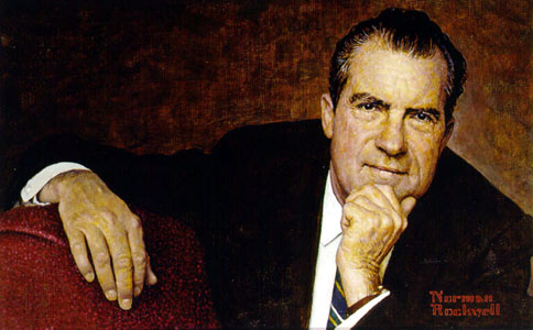
"Richard M. Nixon" by Norman Rockwell, 1968, oil on canvas, National Portrait Gallery, Smithsonian Institution
Last 5 posts by Josh Brown
- The Civil War Draft Riots at 150 – A Public Event - June 17th, 2013
- Alfred F. Young - November 7th, 2012